Fundamentals & Research Recruitment
Why informed consent needs inclusive design

Written by: Jo Schofield
Published on: Last updated:
Consent Kit helps organisations do inclusive research and manage participants’ data responsibly. It:
puts participants in control of how their information is used
gives researchers reassurance that their participant’s consent has been gained compliantly and securely
It meets Web Content Accessibility Guidelines (WCAG) 2.1AA (and will soon meet WCAG 2.2), is compatible with assistive technology and uses plain English. But we know there’s more we could do to help people access and understand what’s being asked of them.
We want to make consent more accessible and understandable to more people.
What’s changed
We’ve iterated Consent Kit so that:
researchers can change the language of the consent form
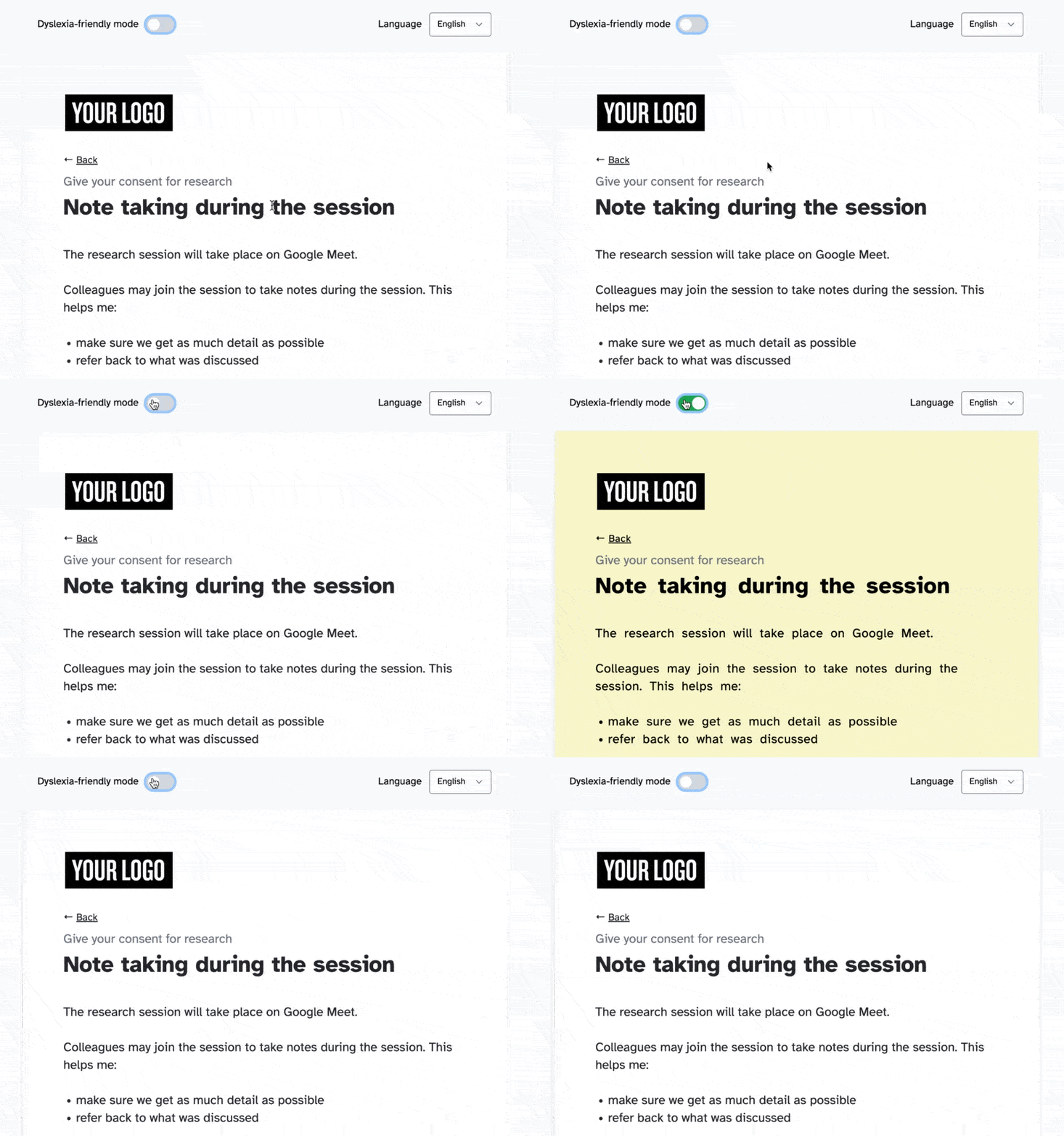
people visiting our forms can choose to use a dyslexia-friendly interface
there’s less, and clearer, content
we focus on one subject or task per page
each question requires an answer
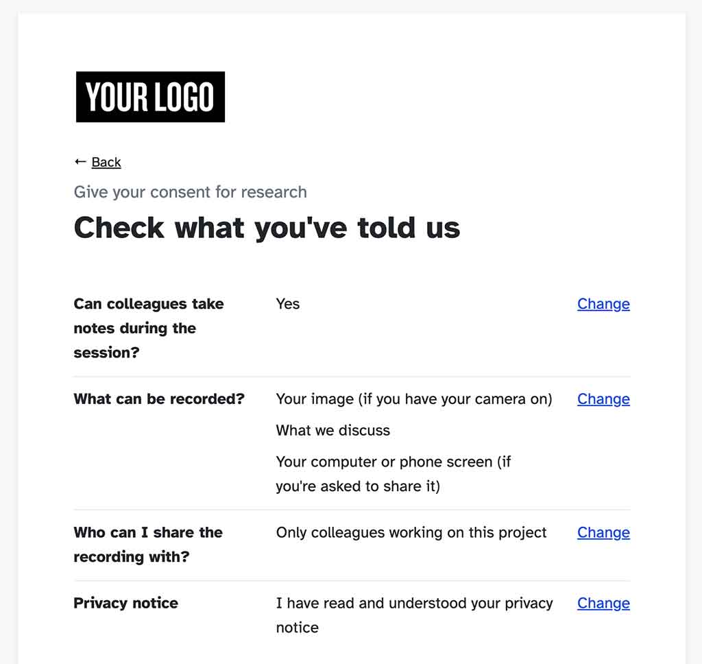
participants can check and change what they’ve told us
researchers can tailor what consent they ask for
Here’s why…
Researchers can change the language of the consent form
Researchers can now change the consent form into Welsh, Spanish, Arabic, French or Dutch for a participant. When the participant submits their consent form, they get email confirmation in that language.
We know that 7.1% of the population (4.1 million) do not speak English as their main language. And a small percentage do not speak English at all (source: 2021 Census).
By only offering a consent form in English we risked people being confused, misinterpreting what was being asked or being excluded from research completely. Offering a choice of language means we’re increasing understanding and inclusion.
We’re adding more language choices as our customers request them.
Participants can choose a dyslexia-friendly interface
Dyslexia affects 1 in 10 people in the UK (source: British Dyslexia Association). People visiting our forms can now choose to apply a ‘dyslexia-friendly’ mode to any screen they’re on. This changes the background colour to cream and can help dyslexic people who find a white background dazzling.
The mode also increases the space between the letters and words. This can improve readability for dyslexic people.

Our default typography and page structure also follow British Dyslexia Association principles that improves readability and comprehension for all. We use:
between 8 to 12 words per line
150% line spacing
16 pixel font size
a san serif, braille institute font (called the 'Atkinson Hyperlegible’ font) which was developed specifically to increase legibility
There’s less, and clearer, content
After a content audit of the existing form it became clear that we could streamline some of the content and move it to more appropriate points in the service. This means we can allow the consent form to focus on just that - giving participants the information they need to make an informed consent decision.
We know that people only read between 20 and 28% of a web page [source: Neilson Norman]. And when they do, they often skim read - looking for content that will get them through a service or complete a task. Too much content can be overwhelming, frustrating and can mean that people give up. It can be especially overwhelming if they have low literacy, English as a second language, or have competing priorities.
We know that we need each word to count. Reducing the amount of content that’s in our consent form will help more participants focus on what’s important, understand the form and complete it.
We focus on one subject or task per page
There’s a lot of information we need participants to understand to be able to make informed decisions. If we talk about multiple subjects on a single page it can be confusing, concentration can lapse and it can prompt regressive reading - people need to skip back to remind themselves of previous content.
Focusing on one subject per page allows participants to focus on what we’re asking and minimises distraction.
For more reasons about why we’ve decided to focus on one thing per page, go to the GOV.UK service manual.
Each question requires an answer
We’ve changed the structure of the questions so that each question requires an answer and the available answers reflect a range of intent.
When the questions were optional we were unsure whether participants did not answer the question because:
it was not applicable to them
they had not seen or read it
they had not understood it
they were not comfortable with the choice of answers
By making the questions mandatory, and allowing participants to choose an answer that reflects their intent, we can be more confident that they’re reading the information and making informed decisions.
We’re allowing participants to check and change what they’ve told us
There are any number of reasons why a participant may need to change something they’ve told us. For example, they’ve misread the question, incorrectly selected an answer, changed their mind or were distracted whilst answering.
By reiterating what a participant told us at the end of the form, and allowing them to change their answer, we can reassure them that their intent is being correctly recorded. It helps us get accurate responses first time.

Researchers can tailor what consent they ask for
Researchers can tailor what consent they ask for depending on the research method being used. For example, the content will change if the research is an interview, usability test or diary study.
To give informed consent, participants need to understand the context their research is operating in. Tailoring the content by research type means participants are only given relevant information - they’re not distracted or confused by details that are not applicable to them. This means we can create a focused, streamlined journey that reduces the cognitive load (the mental effort of getting through it) and get participants through it quicker.
What’s next
WCAG 2.2 was released on 5 October 2023. We’re doing an audit of our services and iterating what we need to for Consent Kit to meet WCAG 2.2. Craig Abbott’s blog post gives a plain English summary of what WCAG 2.2 means for you.
We want to continue exploring how offering alternative languages can aid understanding. We know that some people can feel confident reading English but may need to check certain words or phrases in their first language. So, we’re working on a way for users to switch between different language views for the same piece of content.
We’re also adding ‘branching’ for parts of the consent form - that is, we show or do not show content depending on what’s gone before. This means participants only see content that’s relevant to them. For example, if a participant does not consent to a research session being recorded, they are not shown a question about whether they consent to a recording being shared. This makes the participant’s experience more personalised, relevant and quicker.
Tell us what you think
We’ve made these updates to make responsible research easier for you and your organisation to do. We want to help you create products and services that are informed by, and meet, the needs of a diverse range of people.
To see an example of the updates we’ve discussed in this blog post, go to our live demo consent form.
If you have any feedback, improvements or comments, we’d love to know what you think.


